- Load the R package we will use.
Question: e_charts-1
Create a bar chart that shows the average hours Americans spend on five activities by year. Use the
timelineargument to create an animation that will animate through the years.spend_time contains 10 years of data on how many hours Americans spend each day on 5 activities
read it into spend_time
spend_time <- read_csv("https://estanny.com/static/week8/spend_time.csv")e_charts-1
Start with
spend_time-THEN group_by
year-THEN create an e_chart that assigns
activityto the x-axis and will show activity byyear(the variable that you grouped the data on)-THEN use
e_timeline_optsto set autoPlay to TRUE-THEN use
e_barto represent the variableavg_hourswith a bar chart-THEN use
e_titleto set the main title to ‘Average hours Americans spend per day on each activity’-THEN remove the legend with
e_legendQuestion: e_charts-2
Create a line chart for the activities that American spend time on.
Start with
spend_time-THEN use
mutateto convertyearfrom an number to a string (year-month-day) usingmutate-first convertyearto a string “201X-12-31” using the functionpaste-pastewill paste each year to 12 and 31 (separated by -) THEN-THEN use
mutateto convert year from a character object to a date object using theymdfunction from the lubridate package (part of the tidyverse, but not automatically loaded).ymdconverts dates stored as characters to date objects.-THEN
group_bythe variableactivity(to get a line for each activity)-THEN initiate an
e_chartsobject withyearon the x-axis-THEN use
e_lineto add a line to the variableavg_hours-THEN add a tooltip with
e_tooltip-THEN use
e_titleto set the main title to ‘Average hours Americans spend per day on each activity’-THEN use
e_legend(top = 40)to move the legend down (from the top)Question: modify slide 82
-Create a plot with the
spend_timedata -assignyearto the x-axis -assignavg_hoursto the y-axis -assignactivityto color-ADD points with
geom_point-ADD
geom_mark_ellipse-filter on activity == “leisure/sports” -description is “Americans spend the most time on leisure/sport”ggplot(spend_time, aes(x = year, y = avg_hours , color = activity)) + geom_point() + geom_mark_ellipse(aes(filter = activity == "leisure/sports", description = "Americans spend on average more time each day on leisure/sports than the other activities"))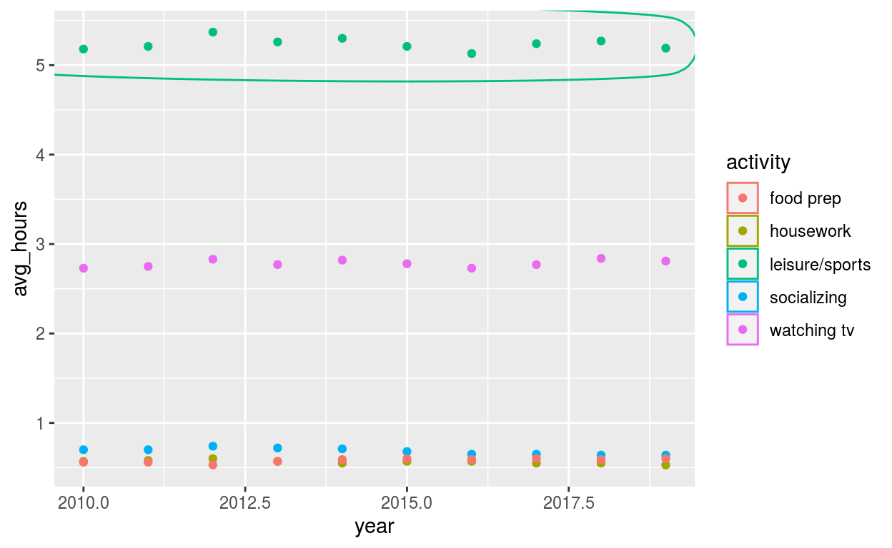
Question: tidyquant
Modify the tidyquant example in the video
Retrieve stock price for Facebook, ticker: FB, using
tq_get-from 2019-08-01 to 2020-07-28
-assign output to
dfdf <- tq_get("FB", get = "stock.prices", from = "2019-08-01", to = "2020-07-28" )Create a plot with the
dfdata-assign
dateto the x-axis-assign
closeto the y-axis-ADD a line with with
geom_line-ADD
geom_mark_ellipse-filter on a date to mark. Pick a date after looking at the line plot. Include the date in your Rmd code chunk. -include a description of something that happened on that date from the pandemic timeline. Include the description in your Rmd code chunk -fill the ellipse yellow
-ADD
geom_mark_ellipse-filter on the date that had the minimum
closeprice. Include the date in your Rmd code chunk. -include a description of something that happened on that date from the pandemic timeline. Include the description in your Rmd code chunk -color the ellipse red-ADD
labs-set the
titleto Facebook -set x to NULL -set y to “Closing price per share” -set caption to “Source: https://en.wikipedia.org/wiki/Timeline_of_the_COVID-19_pandemic_in_the_United_States”ggplot(df, aes(x = date, y = close)) + geom_line() + geom_mark_ellipse(aes( filter = date == "2020-04-18", description = "Governor Gavin Newsom issues the country's first statewide stay-at-home order" ), fill = "yellow") + geom_mark_ellipse(aes( filter = date == "2020-04-26", description = "The total # of reported confirmed cases in the U.S. surpasses that of China with over 85,000, making it the country with the highest # of coronavirus patients in the world" ), color = "red", ) + labs( title = "Facebook", x = NULL, y = "Closing price per share", caption = "Source: https://en.wikipedia.org/wiki/Timeline_of_the_COVID-19_pandemic_in_the_United_States" )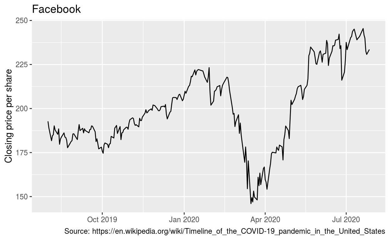
ggsave(filename = "preview.png",
       path = here::here("_posts", "2021-04-20-data-visualization"))