- Load the R package we will use.
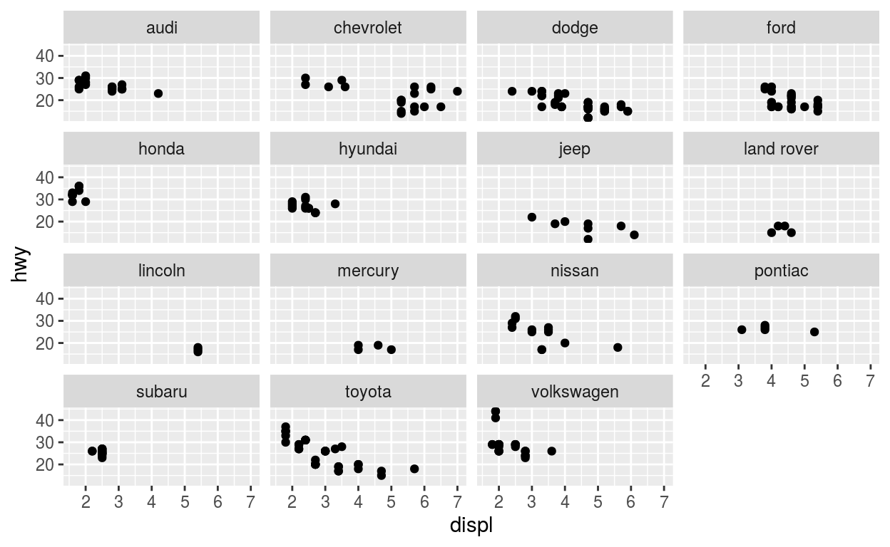
Question: modify slide 51
-Create a plot with the mpg dataset
-add points with geom_point
-assign the variable displ to the x-axis
-assign the variable hwy to the y-axis
-add facet_wrap to split the data into panels based on the manufacturer
ggplot(data = mpg) +
  geom_point(aes(x = displ, y = hwy)) +
  facet_wrap(facets = vars(manufacturer))
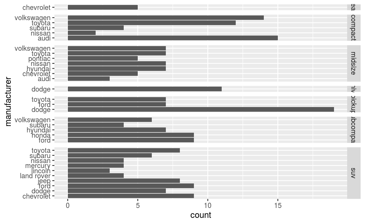
Question: modify facet-ex-2
-Create a plot with the mpg dataset
-add bars with with geom_bar
-assign the variable manufacturer to the y-axis
-add facet_grid to split the data into panels based on the class
-let scales vary across columns
-let space taken up by panels vary by columns
ggplot(mpg) +
  geom_bar(aes(y = manufacturer)) +
  facet_grid(vars(class), scales = "free_y", space = "free_y")
Question: spend_time
To help you complete this question use:
-the patchwork slides and
-the vignette: https://patchwork.data-imaginist.com/articles/patchwork.html
Download the file spend_time.csv from moodle into directory for this post. Or read it in directly:
-read_csv(“https://estanny.com/static/week7/drug_cos.csv”)
-spend_time contains 10 years of data on how many hours Americans spend each day on 5 activities
-read it into spend_time
spend_time <- read_csv("spend_time.csv")
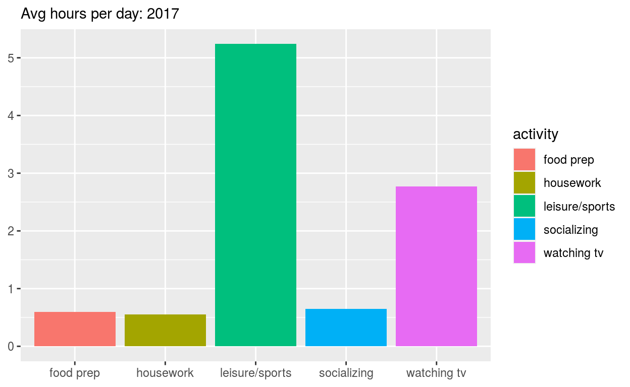
Start with spend_time
-extract observations for 2017
-THEN create a plot with that data
-ADD a barchart with with geom_col
-assign activity to the x-axis
-assign avg_hours to the y-axis
-assign activity to fill
-ADD scale_y_continuous with breaks every hour from 0 to 6 hours
-ADD labs to
-set subtitle to Avg hours per day: 2017
-set x and y to NULL so they won’t be labeled
-assign the output to p1
-display p1
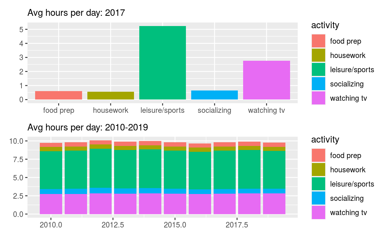
p1 <- spend_time %>% filter(year == "2017") %>%
  ggplot() +
  geom_col(aes(x = activity, y = avg_hours, fill = activity)) +
  scale_y_continuous(breaks = seq(0, 6, by = 1)) +
  labs(subtitle = "Avg hours per day: 2017", x = NULL, y = NULL)
p1
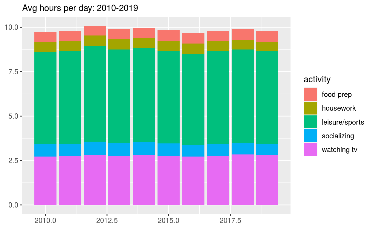
Start with spend_time
-THEN create a plot with it
-ADD a barchart with with geom_col
-assign year to the x-axis
-assign avg_hours to the y-axis
-assign activity to fill
-ADD labs to
-set subtitle to “Avg hours per day: 2010-2019”
-set x and y to NULL so they won’t be labeled
-assign the output to p2
-display p2
p2 <- spend_time %>%
  ggplot() +
  geom_col(aes(x = year, y = avg_hours, fill = activity)) +
  labs(subtitle = "Avg hours per day: 2010-2019", x = NULL, y = NULL)
p2
Use patchwork to display p1 on top of p2
-assign the output to p_all
-display p_all
p_all <- p1 / p2
p_all
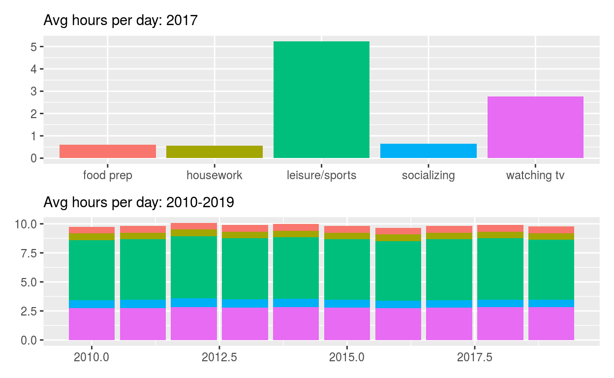
Start with p_all
-AND set legend.position to ‘none’ to get rid of the legend
-assign the output to p_all_no_legend
-display p_all_no_legend
p_all_no_legend <- p_all & theme(legend.position = 'none')
p_all_no_legend
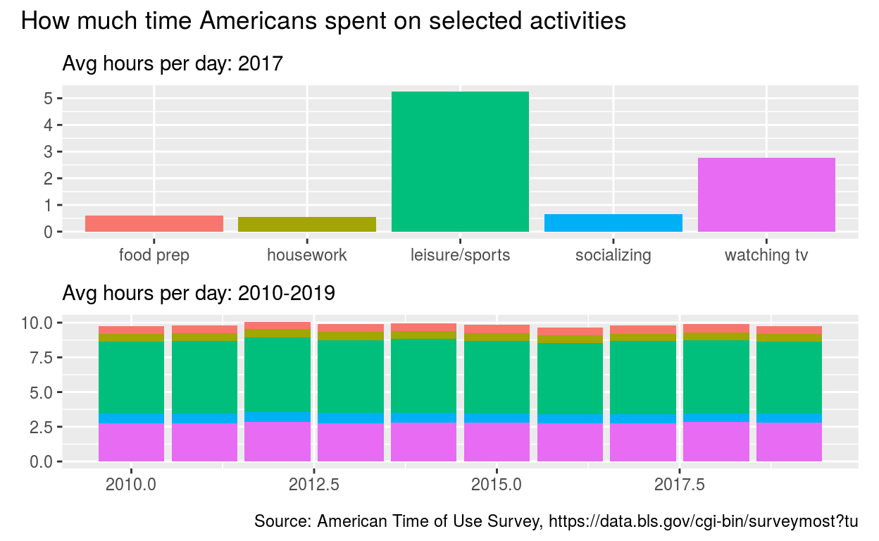
Start with p_all_no_legend
-see how annotate the composition here: https://patchwork.data-imaginist.com/reference/plot_annotation.html
-ADD plot_annotation set
-title to “How much time Americans spent on selected activities”
-caption to “Source: American Time of Use Survey, https://data.bls.gov/cgi-bin/surveymost?tu”
p_all_no_legend +
  plot_annotation(title = "How much time Americans spent on selected activities",
                  caption = "Source: American Time of Use Survey, https://data.bls.gov/cgi-bin/surveymost?tu")
Question: Patchwork 2
use spend_time from last question patchwork slides
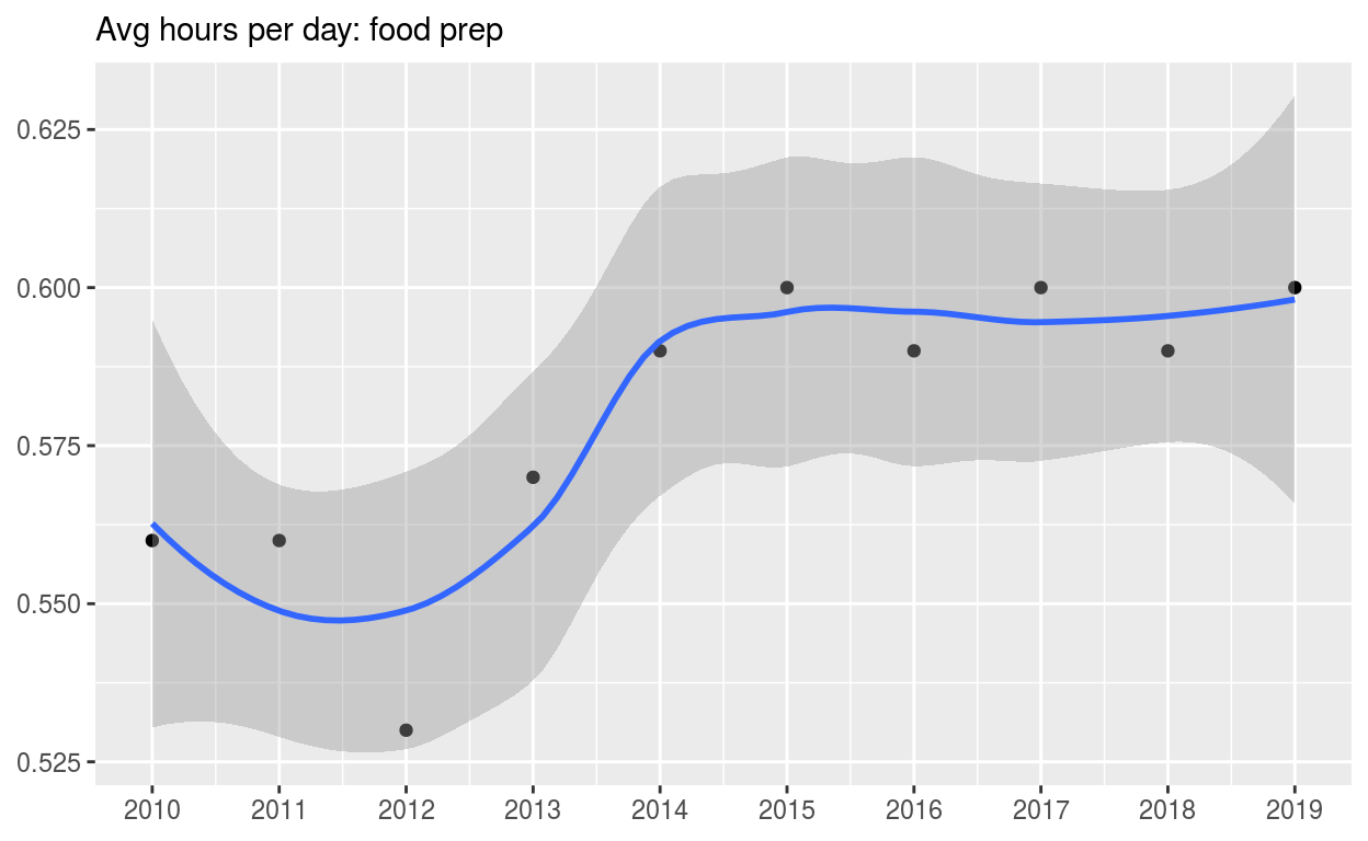
Start with spend_time
-extract observations for food prep
-THEN create a plot with that data
-ADD points with geom_point
-assign year to the x-axis
-assign avg_hours to the y-axis
-ADD line with geom_smooth
-assign year to the x-axis
-assign avg_hours to the y-axis
-ADD breaks on for every year on x axis with with scale_x_continuous
-ADD labs to
-set subtitle to Avg hours per day: food prep
-set x and y to NULL so x and y axes won’t be labeled
-assign the output to p4
-display p4
p4 <-
  spend_time %>% filter(activity == "food prep") %>%
  ggplot() +
  geom_point(aes(x = year, y = avg_hours)) +
  geom_smooth(aes(x = year, y = avg_hours)) +
  scale_x_continuous(breaks = seq(2010, 2019, by = 1)) +
  labs(subtitle = "Avg hours per day: food prep", x = NULL, y = NULL)
p4
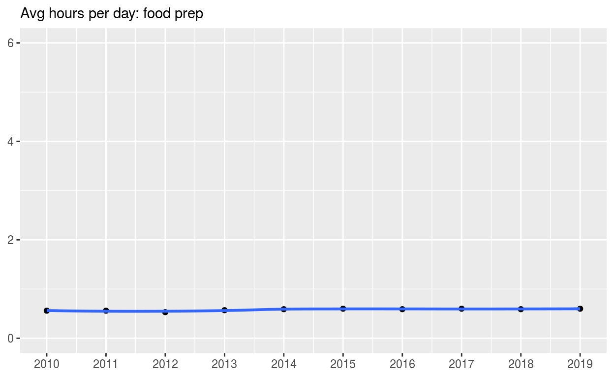
Start with p4
-ADD coord_cartesian to change range on y axis to 0 to 6
-assign the output to p5
-display p5
p5 <- p4 + coord_cartesian(ylim = c(0, 6))
p5
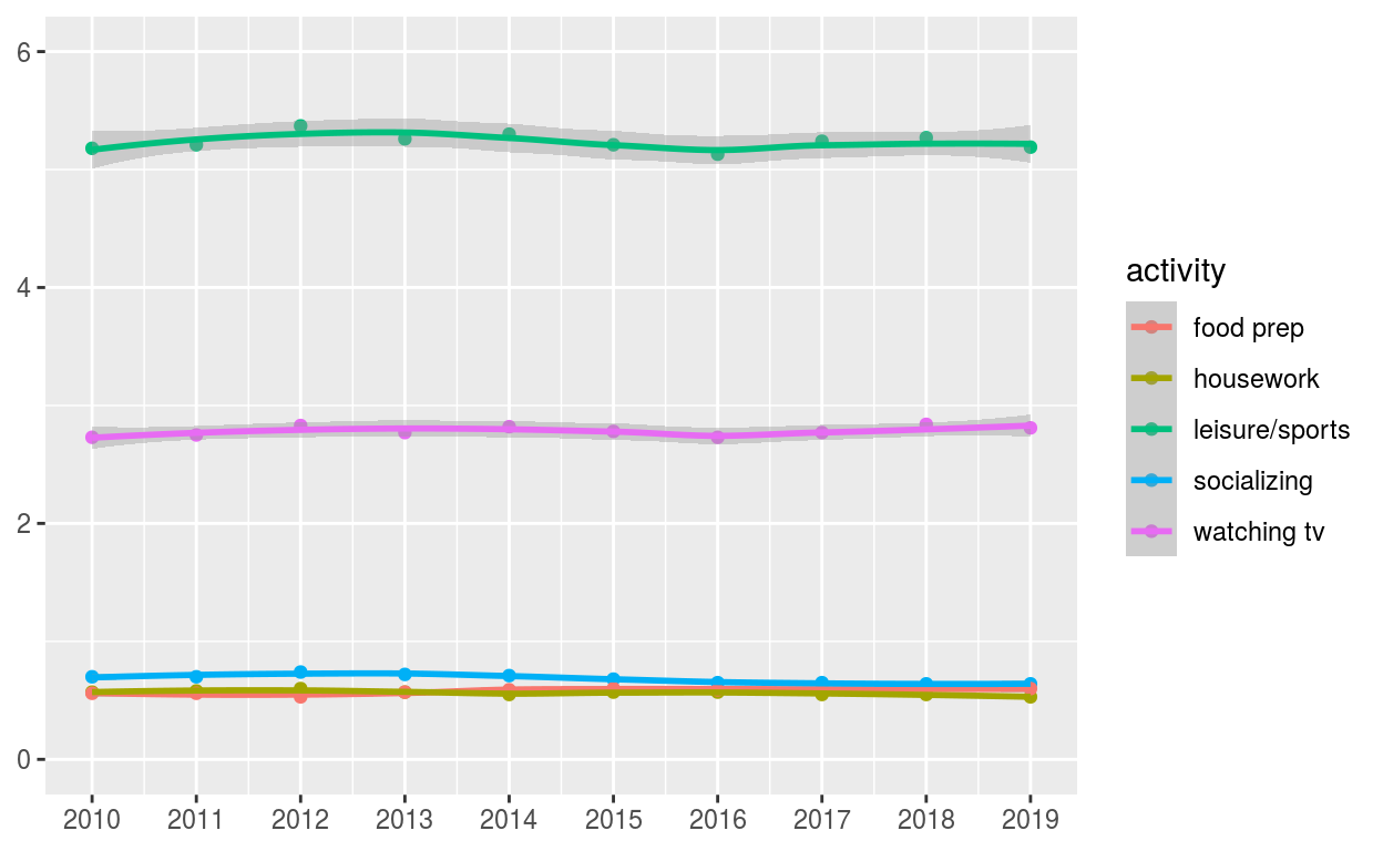
Start with spend_time
-create a plot with that data
-ADD points with geom_point
-assign year to the x-axis
-assign avg_hours to the y-axis
-assign activity to color
-assign activity to group
-ADD line with geom_smooth
-assign year to the x-axis
-assign avg_hours to the y-axis
-assign activity to color
-assign activity to group
-ADD breaks on for every year on x axis with with scale_x_continuous
-ADD coord_cartesian to change range on y axis to 0 to 6
-ADD labs to
-set x and y to NULL so they won’t be labeled
-assign the output to p6
-display p6
p6 <-
  spend_time %>%
  ggplot() +
  geom_point(aes(x = year, y = avg_hours, color = activity, group = activity)) +
  geom_smooth(aes(x = year, y = avg_hours, color = activity, group = activity)) +
  scale_x_continuous(breaks = seq(2010, 2019, by = 1)) +
  coord_cartesian(ylim = c(0, 6)) +
  labs(x = NULL, y = NULL)
p6
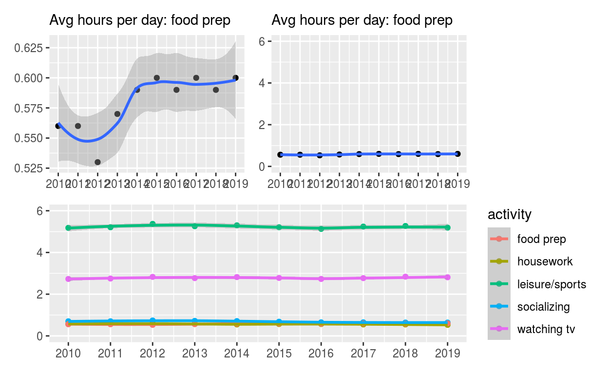
Use patchwork to display p4 and p5 on top of p6
(p4 | p5)/p6
ggsave(filename = "preview.png",
       path = here::here("_posts", "2021-04-06-exploratory-analysis-ii"))