- Load the R package we will use.
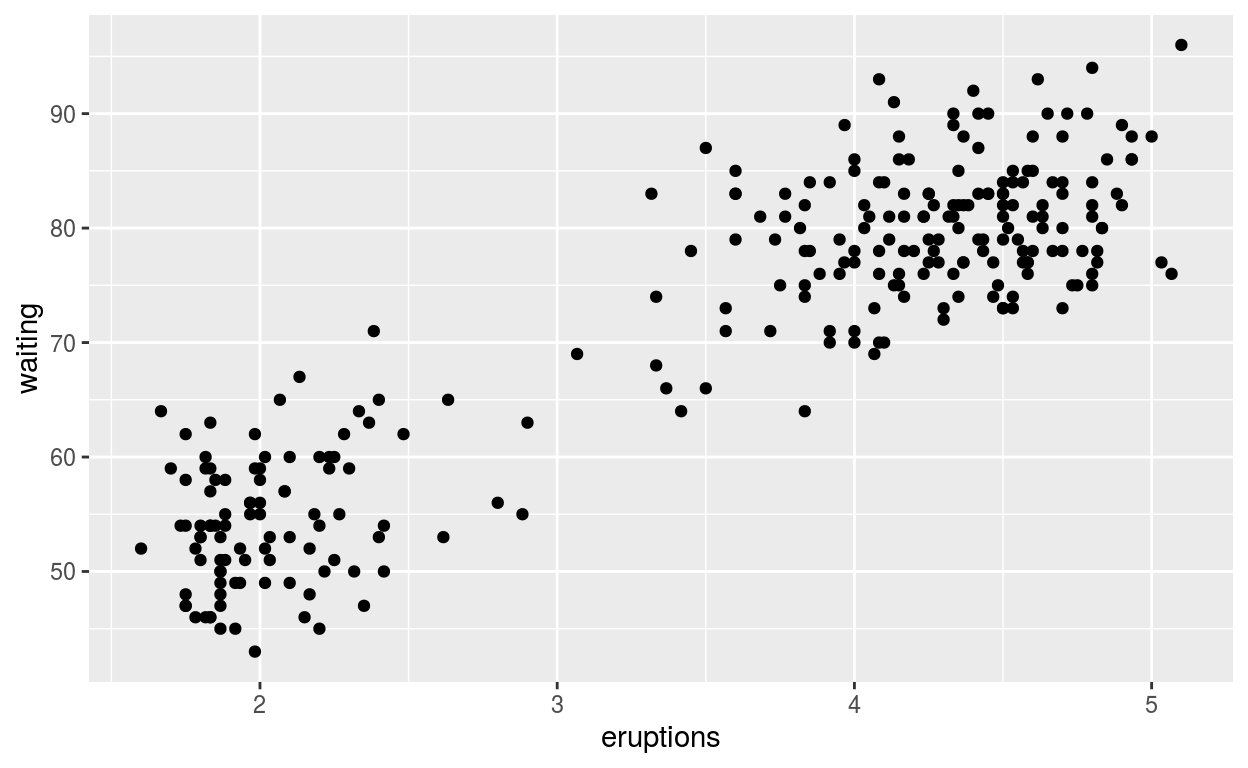
Question: modify slide 34
-create a plot with the faithful dataset
-add points with geom_point
-assign the variable eruptions the the x-axis
-assign the variable waiting to the y-axis
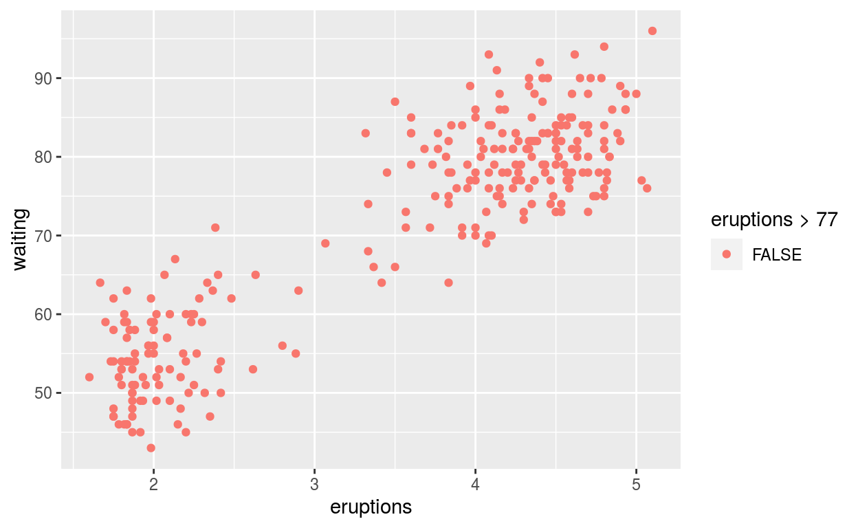
-colour the points according to whether waiting is smaller or greater than 77
data("faithful")

ggplot(data = faithful,
       mapping = aes(x = eruptions, y = waiting)) +
  geom_point()

ggplot() +
  geom_point(mapping = aes(x = eruptions, y = waiting),
             data = faithful)
ggplot(faithful) +
  geom_point(aes(x = eruptions, y = waiting, colour = eruptions > 77))
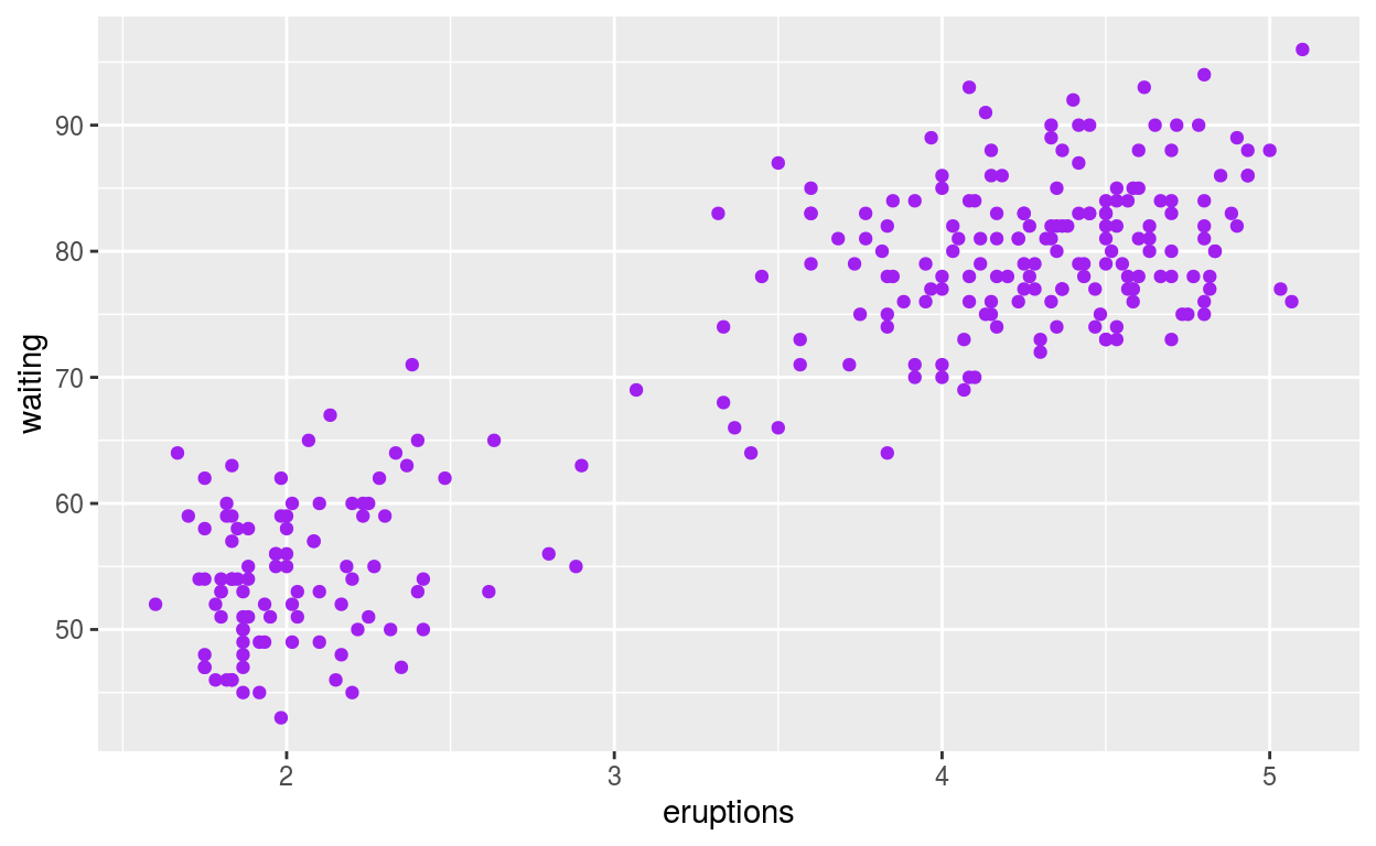
Question: modify intro-slide 35
-Create a plot with the faithful dataset
-add points with geom_point
-assign the variable eruptions to the x-axis
assign the variable waiting to the y-axis
-assign the colour purple to all the points
ggplot(faithful) +
  geom_point(aes(x = eruptions, y = waiting),
             colour = 'purple')
ggsave(filename = "preview.png",
       path = here::here("_posts", "2021-03-30-exploratory-analysis"))
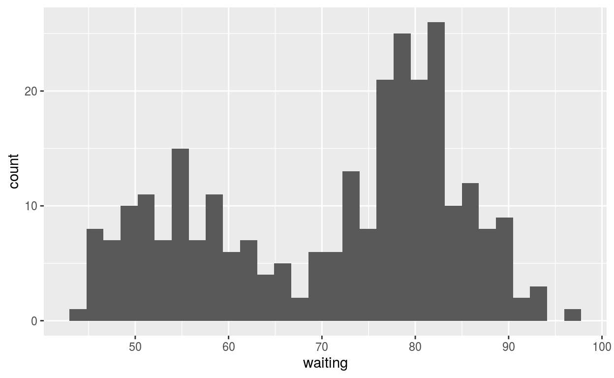
Question: modify intro-slide 36
-Create a plot with the faithful dataset
-use geom_histogram() to plot the distribution of waiting time
-assign the variable waiting to the x-axis
ggplot(faithful) +
  geom_histogram(aes(x = waiting))
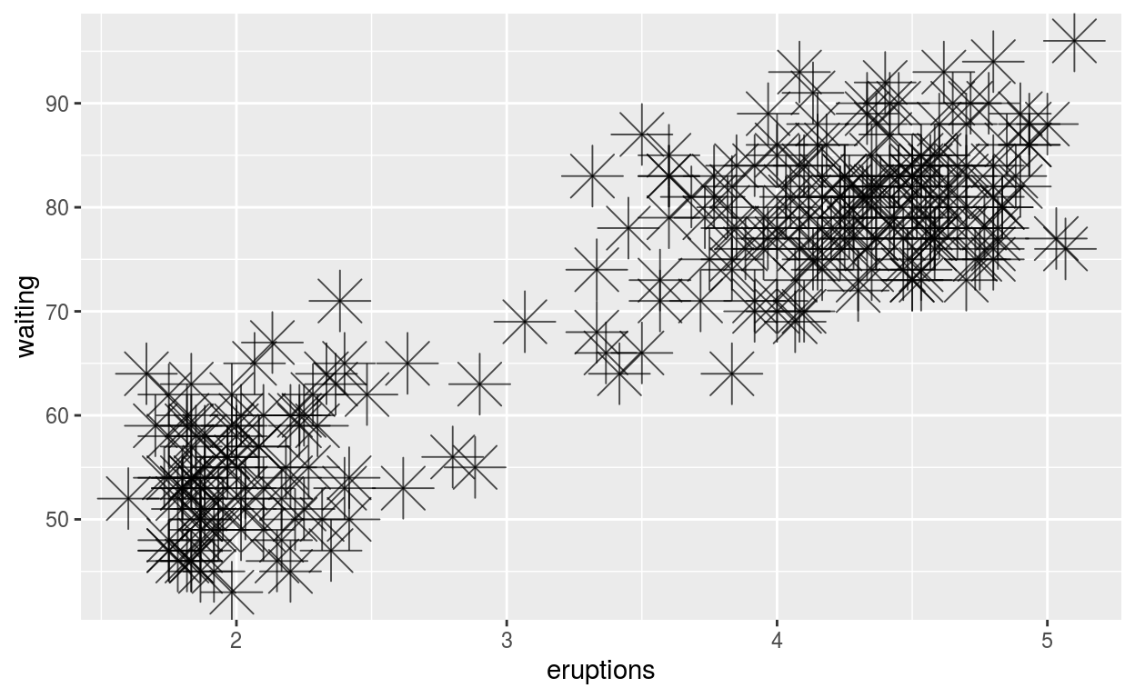
Question: modify geom-ex-1
-See how shapes and sizes of points can be specified here
-Create a plot with the faithful dataset
-add points with geom_point
-assign the variable eruptions to the x-axis
-assign the variable waiting to the y-axis
-set the shape of the points to asterisk
-set the point size to 8
-set the point transparency 0.7
ggplot(faithful) +
  geom_point(aes(x = eruptions, y = waiting),
             shape = "asterisk", size = 8, alpha = 0.7)
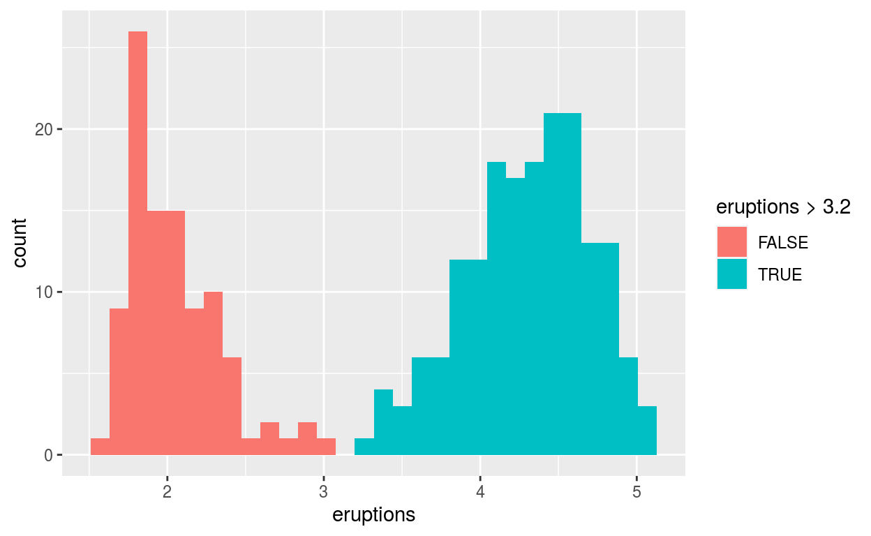
Question: modify geom-ex-2
-Create a plot with the faithful dataset
-use geom_histogram() to plot the distribution of the eruptions (time)
-fill in the histogram based on whether eruptions are greater than or less than 3.2 minutes
ggplot(faithful) +
  geom_histogram(aes(x = eruptions, fill = eruptions > 3.2))
Question: modify stat-slide-40
-Create a plot with the mpg dataset
-add geom_bar() to create a bar chart of the variable manufacturer
data("mpg") +
  geom_bar(aes(x = manufacturer))
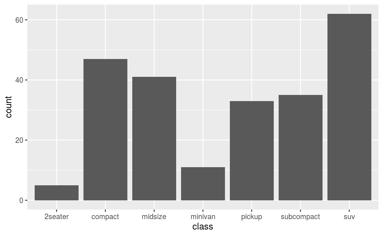
NULLQuestion: modify stat-slide-41
-change code to count and to plot the variable manufacturer instead of class
mpg_counted <- mpg %>%
  count(class, name = 'count')
ggplot(mpg_counted) +
  geom_bar(aes(x = class, y = count), stat = 'identity')
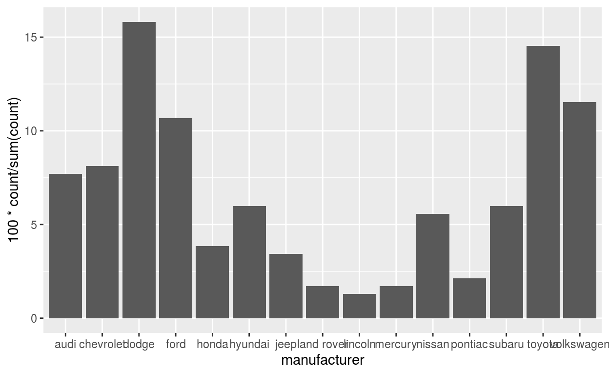
Question: modify stat-slide-43
-change code to plot bar chart of each manufacturer as a percent of total
-change class to manufacturer
ggplot(mpg) +
  geom_bar(aes(x = manufacturer, y = after_stat(100 * count / sum(count))))
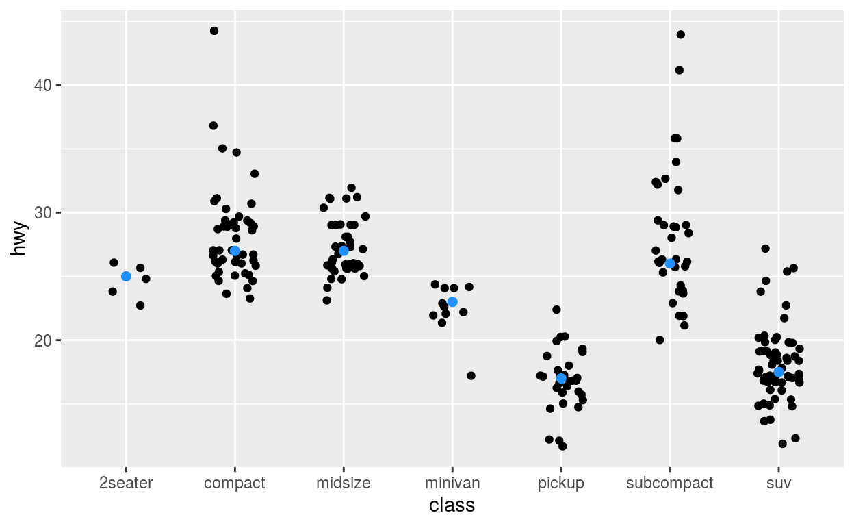
Question: modify answer to stat-ex-2
-For reference see examples.
-Use stat_summary() to add a dot at the median of each group
-color the dot dodgerblue
-make the shape of the dot plus
-make the dot size 2
ggplot(mpg) +
  geom_jitter(aes(x = class, y = hwy), width = 0.2) +
  stat_summary(aes(x = class, y = hwy), geom = "point",
               fun = "median", color = "dodgerblue", size = 2)